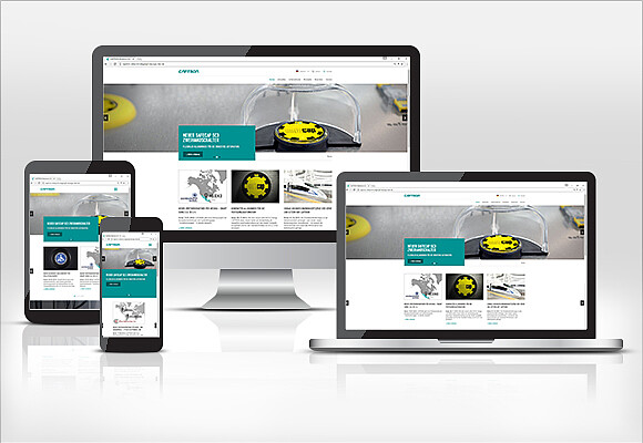
CAPTRON's new website - optimized for mobile devices.
News 02/21/17: In addition to the new and modern design, the CAPTRON website has also been optimised specifically for mobile devices, allowing it to be used on smartphones and tablets.
This responsive design makes it easier to use on all kinds of different displays and follows the trend set by mobile Internet users. Striking design elements, flat navigation, large product and application images and plenty of space for video material immediately catch the viewer's eye. The focus of the design was also to make the website useful as an information and dialogue platform. With a service area developed especially for them, customers, prospective clients and even CAPTRON employees are able to benefit from the download centre, media centre and product FAQs.

 German
 English
 Chinese
 Polish

